This notebook is part of a set of examples for teaching Bayesian inference methods and probabilistic programming, using the numpyro library.
Imports
import ioimport arviz as azimport jaximport jax.numpy as jnpimport matplotlib.pyplot as pltimport numpy as npimport numpyroimport numpyro.distributions as distimport numpyro.inferimport pandas as pdfrom arviz.labels import MapLabellerfrom IPython.display import display
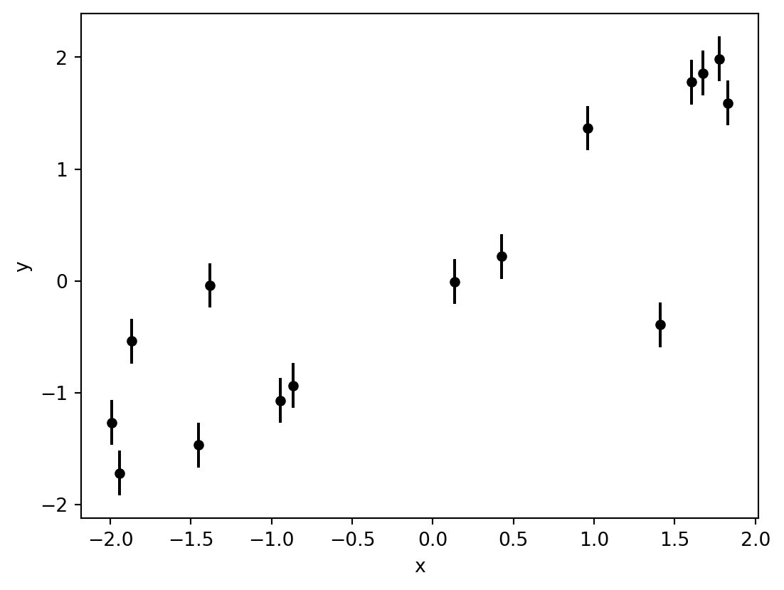
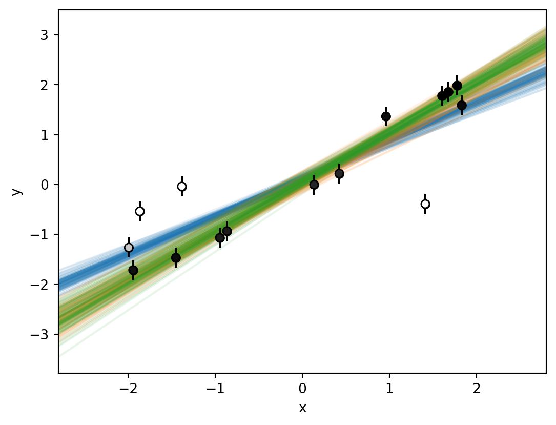
Figure 1: A set of 15 data points that have some linear correlation.
x
y
y_err
0
-1.991
-1.265
0.2
1
-1.942
-1.718
0.2
2
-1.866
-0.539
0.2
3
-1.451
-1.468
0.2
4
-1.383
-0.040
0.2
5
-0.947
-1.069
0.2
6
-0.865
-0.935
0.2
7
0.135
-0.006
0.2
8
0.424
0.219
0.2
9
0.960
1.366
0.2
10
1.411
-0.392
0.2
11
1.603
1.777
0.2
12
1.675
1.857
0.2
13
1.777
1.986
0.2
14
1.828
1.590
0.2
Models
Model A
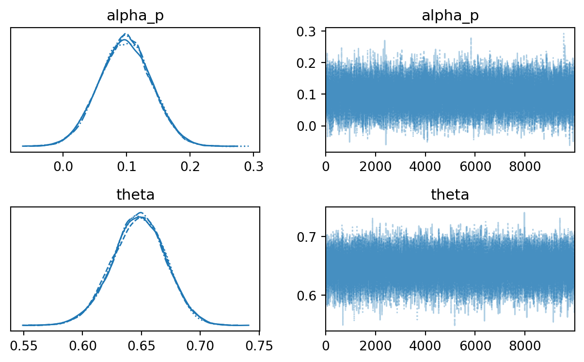
Let’s start with a minimal linear model parametrized by a slope \(\beta\) and intercept \(\alpha\), which does not take outliers into account:
\[y(x_i)=\alpha+\beta\,x_i\]
To be able to choose convenient minimally informative priors, let’s reparametrize this model and use the angle \(\theta\) between the line and the \(x\)-axis instead of the slope, as well as the perpendicular intercept \(\alpha_p\) instead of the \(y\)-axis intercept:
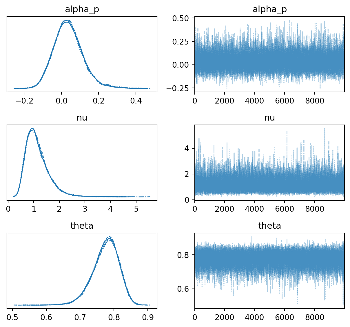
To make the model more robust against outliers, let’s try to use the \(t\) distribution as the sampling distribution instead of the normal distribution. In comparison, the \(t\) distribution has heavier tails, the strength of which can be controlled by an additional free parameter \(\nu\).
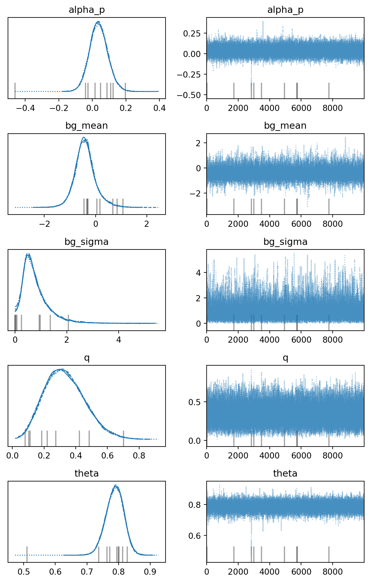
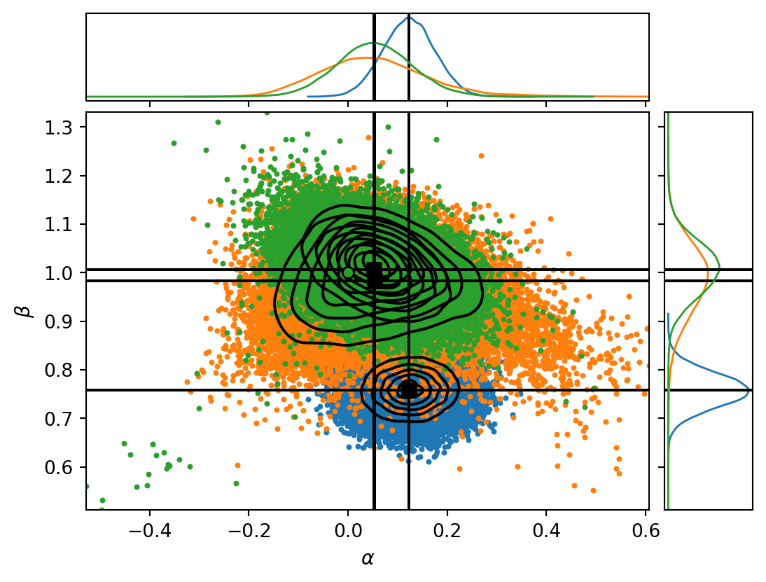
Let’s also try to extend model A into a two-component mixture model, where we keep model A as a “foreground” model, but add an explicit “background” model for outliers (a broad normal distribution).
def plot_samples(*items, p=None, ax=None): marker_style = {"marker": "o", "s": 36, "zorder": 2} ax = plot_data(scatter_kwargs=marker_style, ax=ax) x_min, x_max =-2.8, 2.8 x = np.linspace(x_min, x_max, 50)for i, inf_data inenumerate(items): samples = az.extract( data=inf_data, var_names=["alpha", "beta"], num_samples=100 ).to_dataframe()for _, d in samples.iterrows(): y = d["alpha"] + d["beta"] * x ax.plot(x, y, c=f"C{i}", alpha=0.1, zorder=1)if p isnotNone: marker_style = {**marker_style, "zorder": 3} ax.scatter(data["x"], data["y"], c=p, cmap="gray", ec="black", **marker_style) ax.set_xlim(x_min, x_max)return axplot_samples(inf_data_A, inf_data_B, inf_data_C, p=p_outlier)plt.show()
Figure 9: A few realizations of models A (blue), B (orange), and C (green), shown together with the original data points. The opacity of each data point indicates its probability of being an outlier, as estimated from model C.